均等配置したリストの最終行を、左寄せにする方法( justify-content: space-betweenを使った場合 )

 :
:Flexboxを使って均等配置したリストの最終行を、左揃えにする方法を紹介します。
")
目次
はじめに
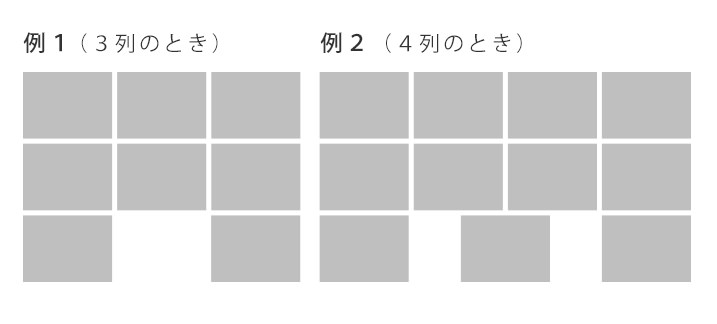
Flexbox(justify-content: space-between、flex-wrap: wrap;)を使って並べると、最終行が下記のレイアウトになります。これを、均等配置のまま 最終行は左揃えにする方法を紹介します。
ベースになるHTML・CSS
		<ul class="sample">
			<li><img src="https://placehold.jp/ccc/ccc/100x50.jpg" alt=""></li>
			<li><img src="https://placehold.jp/ccc/ccc/100x50.jpg" alt=""></li>
			<li><img src="https://placehold.jp/ccc/ccc/100x50.jpg" alt=""></li>
			<li><img src="https://placehold.jp/ccc/ccc/100x50.jpg" alt=""></li>
			<li><img src="https://placehold.jp/ccc/ccc/100x50.jpg" alt=""></li>
			<li><img src="https://placehold.jp/ccc/ccc/100x50.jpg" alt=""></li>
			<li><img src="https://placehold.jp/ccc/ccc/100x50.jpg" alt=""></li>
			<li><img src="https://placehold.jp/ccc/ccc/100x50.jpg" alt=""></li>
		</ul>
		<style>
			ul.sample {
				max-width: 400px;
				display: flex;
				justify-content: space-between;
				flex-wrap: wrap;
			}
		</style>
3列のとき
サンプル

		<ul class="sample">
			<li><img src="https://placehold.jp/ccc/ccc/100x50.jpg" alt=""></li>
			<li><img src="https://placehold.jp/ccc/ccc/100x50.jpg" alt=""></li>
			<li><img src="https://placehold.jp/ccc/ccc/100x50.jpg" alt=""></li>
			<li><img src="https://placehold.jp/ccc/ccc/100x50.jpg" alt=""></li>
			<li><img src="https://placehold.jp/ccc/ccc/100x50.jpg" alt=""></li>
		</ul>
		<style>
			ul.sample li {
				width: 26%;
			}

			ul.sample1::after {
				content: "";
				display: block;
				width: 26%;
				height: 0;
			}
		</style>
ポイント
ulのafter(一番後ろの位置)に、liと同じ幅(高さは不要)の擬似要素を入れることで、左寄せになります。
4列のとき
最後の行が2つのときのサンプル
最後の行が3つのときのサンプル
		<style>
			ul.sample li {
				width: 21%;
			}

			ul.sample::after,
			ul.sample::before {
				content: "";
				display: block;
				width: 21%;
				height: 0;
			}

			ul.sample::before {
				order: 1;
			}
		</style>
ポイント
3列のときと違うのは、afterだけでは要素が足りないので、beforeも使います。ここで気をつけないといけないのは、beforeにorderを指定して、順番を変えることです。
最後に
もし5列以上ある場合は、floatを使うか、javascriptで調整できます。
flexboxは便利なところもあり、今回のように調整が必要なところもあるので うまく使っていきたいですね(´▽`*)♪